Web design challenge
Having recently completed an extensive redevelopment of their London headquarters, Blackstone’s marketing team commissioned a range of new media content centred around their newly extended building and they asked us how we could help make this part of their website.
Being mainly designed around text based content, the website didn't have a ready-made place to showcase images and video in an impactful and prominent way, so it was time for us to get creative.
Design objectives
- Make the redeveloped building the centrepiece of the home page, without detracting from the core purpose of the website.
- Maintain the core DNA of the current website design – the new media content should look like an integral part of the website and not a ‘stuck-on afterthought’.
- Improve the homepage to provide easier navigation to core areas of the site
- Update the wider site styling to give a cleaner, more refined look
User needs
We got really clear on the marketing team’s goals and objectives so the next thing was to get into the minds of the website’s core users. As web designers, it’s our job to think about users and how best we can meet their needs…
- Clients and prospects want to find barristers who are well suited to their particular case. We want them to gain trust in Blackstone Chambers’ offering to the point where they contact the clerking team to make an enquiry.
- Law students and trainee barristers want to know more about Blackstone’s pupillage offering so the website should help inform their decision to apply.
The website’s analytics tells us it already attracts lots of traffic and the home page does a great job of signposting people to where they need to go.
It was also interesting to note a 70-30 split between desktop browsers vs mobile & tablet users for this website. Clearly the website needs to cater for users across large and small screens – that’s a given. But this insight tells us our priority is on desktop screens when designing.
The essence of our job was to use video to create an elevated impression of Blackstone Chambers while making sure users can still find what they need easily.
The solution we built
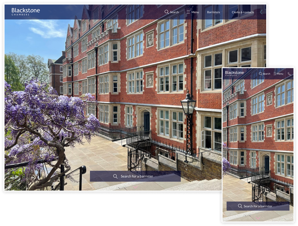
We built a new hero section capable of handling any media, be it a still image or dynamic video. This section occupies the entire available screen space, giving a high impact visual first impression. If a video is used as the background, this silently plays and loops automatically.
The Barrister search bar was a key feature of the original design and is the primary navigation tool for our core users, so that remains a prominent feature in this top section. As you scroll down, some smooth animation reveals key messaging and the search bar receives more prominence. This provides a useful hint as to what the user can do next, and adds to the delight of using the website which is good for building trust with the user and maintaining their attention.
The top navigation bar got a redesign too, with a slight transparency allowing the hero to shine through. It’s a nice way of making the video feel part of the page. We also cleaned up the navigation, hiding features such as their shortlist until they're actually used.
Moving to such a media-heavy first impression means page load is more important than ever. Thankfully, the site’s media is served from state of the art hosting infrastructure and is cached in the browser so it’s super-economical with bandwidth and shortens loading delays often associated with presenting large images and videos on websites. If video is being used, a scaled-down, mobile-optimised version is served to users on smartphones to ensure it loads quickly on mobile networks.
Expanding the homepage
While redesigning the homepage, we added a couple of extra sections to help signpost other areas of the site, and improve the site's SEO prospects with more content.
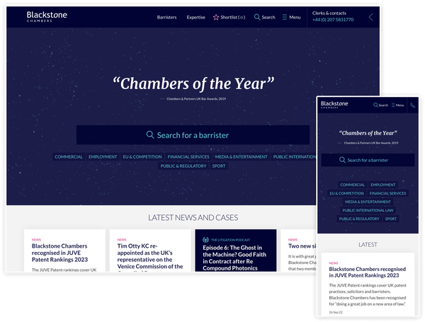
A new bank of cards provides quick access to pages on individual expertise, as well as clearly displaying the range of specialisms Blackstone's barristers offer to clients. A few of these keywords were displayed in the previous hero section design, but moving to a separate section with unique styling helps them stand out and give a clearer context.
To provide information and links to visitors wanting to learn more, we added an ‘about us’ style section.
This gives room for a snappy summary of the chambers and what they stand for, with space for some links to further information aimed at prospective law students and trainee barristers.
We also added a small text carousel showcasing high profile testimonials and credentials to reinforce authority and trustworthiness.
Accessibility testing
As a standard part of our design work, all elements undergo thorough accessibility testing using a range of tools using both automatic and manual tests. Things like ensuring colours have sufficient contrast ratios, visual elements have adequate text labelling, and ensuring keyboard navigation are taken into consideration to make sure anything we build is accessible to as many users as possible.
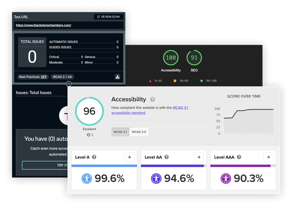
We know scores aren’t everything, but it’s still pretty good to see a raft of high scores on accessibility testing!
Improving the design and user experience site-wide
As we got further into our discovery, ideas for other improvements began to emerge.
The previous design had a speckled dust texture throughout the site which was beginning to look a little dated next to the slick, vibrant homepage media. We experimented with different textures, taking visual cues from parts of the media provided by Blackstone’s marketing team where objects in the distance and vibrant colours blend together. By carrying these textures throughout the rest of the homepage and elsewhere on the site, we made the imagery feel more of an integrated feature throughout.
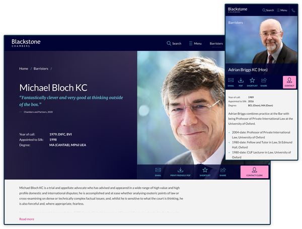
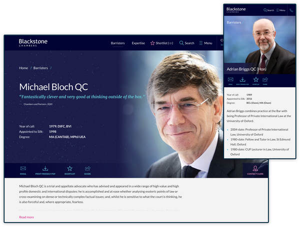
A facelift for the header
Replacing the dust with our sophisticated new texture gave us an opportunity to improve other areas of design and user experience. The header on all barrister profile pages is a prime feature of the website where information design and UX are key. Our updated design reads from left to right with key information placed on the left and all interactive elements on the right, including raising the prominence of the primary call to action contact button. This was also further improved on mobile to make use of the restricted screen space, making interactive elements easier to read.
The results
We delivered a refreshed, vibrant and expanded homepage that showcases Blackstone’s major building redevelopment without losing an established design identity. The new sections we created offer more SEO weight and help to signpost other areas of the site with more context. Our attention to responsive design and design for accessibility means the website delivers the goods on any platform and for all users.