Wagtail 4 has arrived...
We like to keep our clients’ websites updated with the latest and greatest software, fixing security issues and introducing new features.
So when the release of Wagtail 4 was announced last month, I was excited to try out some of the new features. What better way to get started than to upgrade the Cursive website?
The Cursive website was already on Wagtail 3, so the upgrade process was pretty painless. I read the release notes, updated a couple of packages and boom!
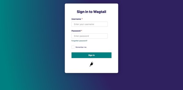
Just look at that sign in screen
All new editing experience
The main focus of this release has been the admin UI and page editor.
Google has provided sponsorship to support the development of the ‘next-generation’ page editor. Gone are the teal headings and grey panels, replaced by a slick looking, clutter free editing experience…allowing the user to better deal with the task of creating and managing content.
Richer text
The rich text editor has had a revamp. It’s new simplified design is still as feature-rich, but it now appears where you need it when you highlight the piece of text you want to work on. A popup context menu appears, allowing different styles or links to be applied. Perfect for formatting blocks of text after pasting it in from your chosen text editor.
New to the mix is the Command palette function. Start a block with a slash ‘/’ to open the palette and change the text format. This is great for writing content into the editor afresh. This menu also allows you to insert new blocks or split blocks directly from within the rich text editor.
Improved RTL support. The editor’s UI now displays correctly in right-to-left languages. Perfect for multilingual websites.
Auto-create links when pasting URLs on selected text.
Support for markdown shortcuts for creating numbered/bullet lists, bold and italic text directly in the editor.
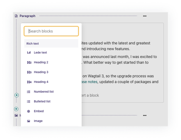
Work with less clutter using new context menus
Live preview
I’ve used few CMS’s over the years, and one of the features that I’ve found useful is being able to preview how content looks without publishing anything. Wagtail has always had a preview feature, but with Wagtail 4 it’s stepped up a level, it’s just got so much better.
The new live preview feature in the Wagtail 4 page editor allows content changes to be previewed as you work, with the added bonus of being able to see how your changes look on mobile/desktop screen sizes.
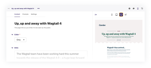
Live preview - see your changes as you make them
StreamField navigation
StreamFields are a killer feature of Wagtail. They provide a flexible way to easily insert/edit/move blocks of content. As an editor, you are no longer constrained to a fixed page schema, allowing you to express yourself and your content more freely.
However, with this flexibility comes the challenge of creating an editorial experience that is not unwieldy and overwhelming.
The underlying ethos of the new Wagtail 4 UI seems to be...show the user things that they need, only when they need it.
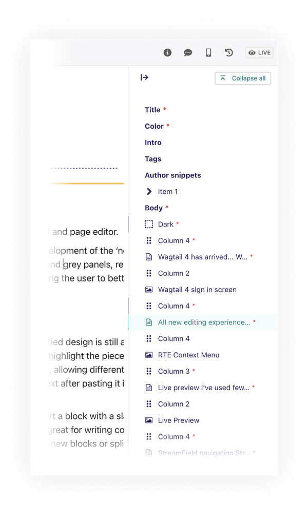
With this in mind, the new page editor interface brings several improvements to StreamFields. Moving the mouse pointer over a StreamField block, brings the UI to life, displaying add/remove control, providing collapsable blocks by default, and displaying guides that indicate the nesting levels.
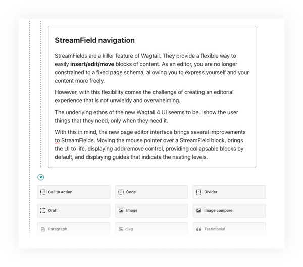
Improved StreamField navigation and block selection
Other notable improvements
Global settings have been improved. We can now create settings that apply to all sites rather than just a single site... very useful for websites that use Wagtail’s powerful multi-site configuration.
Huge accessibility improvements to the way the editing interface is structured and presented, with better support for admin colour themes and Windows High Contrast mode.
The page editor UX and UI improvements are carried through to other parts of Wagtail, for a more consistent experience across the board.
Snippets are really useful for presenting a single piece of content on multiple pages in a website. Often, snippets will be rendered in different ways, depending where in the site they get placed. The latest update allows snippets to be previewed in the various ways they get rendered. Further to this, Snippets will soon have different versions and revision history and draft/live statuses.
So is it worth upgrading?
The short answer is yes.
Having used Wagtail 4 to write this article, I think it’s fab... it’s really easy to use and it looks great. The live preview feature works well. Working with StreamFields, especially when they are complex or nested, the experience is much better.
I can’t wait to share these awesome improvements with our clients. Watch this space...
An update on updates!
Since writing this, Wagtail has moved to version 4.1, bringing a range of fixes and new features. The star addition for us is a new page minimap feature.
Essentially a table of contents for the page, this minimap lists all sections and blocks used on the page, complete with any validation errors. It lives on all pages, tucked out of the way on the right until it's needed. This is incredibly useful for pages with large amounts of content and screens with limited space, and another excellent reason to upgrade.
