Cursive works on making GO Lab’s research deliver meaning and value to a global audience.
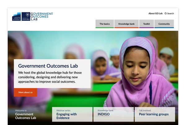
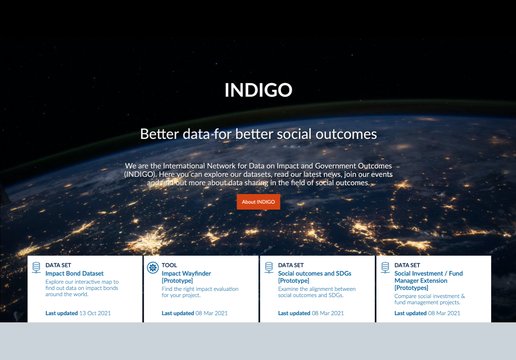
We helped to shift GO Lab’s website from being a UK knowledge hub to the global source of truth for Social Outcomes. With this repositioning came a bold new design to present their messaging and content with more clarity.

Re-workshop
Through collaborative workshops our teams came together to reshape the website’s structure, aligning it with the needs of three core audience groups. For unaffiliated users looking for a broad overview of the subject, we have The basics. Those with a deeper understanding in search of details, facts and stats, we have Knowledge bank. The Tools section is for those who need practical guides to support their work. Community is where to contribute and connect through events, blogs and news.
We built a new, streamlined global navigation to speed up way-finding with fewer page-loads. Our aim is always to give users what they want as quickly and easily as possible.
Designing long-form articles
As designers and developers, it’s surely not our place to weigh in on the content. We make the tools, you bring the content…that’s how it works, right? Well not entirely. It’s important for us to understand the intended type and length of content so we can ensure a good user experience.
GO Lab’s Technical Guides can get quite long (~60 minutes read time in some cases) because they deal with complex matters in great detail. We wanted to make sure the article length isn’t off-putting for readers. We designed clear and legible chapter navigation and typography for the reader to consume the content in manageable chunks or to skim through whole sections. Or even jump in and out of the articles to get snippets of information easily. Our in-page indicator shows their place in the overall article and all pages are built to work beautifully on mobile, tablet and desktop screens. We know how important the mobile experience is for users and search engines alike so making websites work on mobile is good for accessibility.
Accessibility is not optional
Everyone is invited – that’s surely a central premise for a global website. We use the Web Content Accessibility Guidelines (WCAG 2.1) standards to ensure maximum access for all. The tools we use offer detailed reporting on where design, development and editorial efforts are needed and we get a handy score when we’re finished to add a game-play element to the work.
We gave a little jump for joy when we achieved a 99.9% accessibility score for this website. As it’s a legal requirement for University and public sector websites to comply with WCAG 2.1 standards so we’ll keep working with GO Lab as the website grows to make sure it remains compliant.
It’s all part of our ongoing commitment to their success.
SVGs for accessibility wins
GO Lab’s content can be both visual and ‘texty’. The usual JPEG and PNG image formats don’t play well with accessibility standards when it comes to diagrams that contain a lot of text. They also don’t work well on smaller screens with text often becoming illegible.
We needed a way for GO Labs diagrams to maintain their layout whilst remaining clear and legible on all screen and crucially, to remain accessible for all screen sizes. The answer lay in using Scalable Vector Graphics (SVGs) containing live, readable text and, where necessary, being able to switch between horizontal and vertical versions of a diagram.
Here’s how it works…
This diagram is as an SVG with an alternative mobile version for optimum clarity across all devices.
Getting live data across, visually
Sometimes you need a picture and sometimes pictures aren’t enough. Getting information and ideas across in a small space is a challenge we can solve with data visualisation and animation. Here’s one we’ve recreated using a screen capture. The real thing is driven by editable data. This means our client can edit bar graph data in a jiffy – just as if it were copying and pasting a line of text. So their animated graphs are as slick as they are current. We used the same tech to power our own graphing and visualisation service, Grafl.
The Cursive team certainly knows how to make data and datasets more digestible for our audience.
Same programme, different timezone
Online and hybrid events are here to stay. They make it easier for people in different parts of the world to come together without the burden of getting on a plane. But there are still technical challenges to overcome. To give attendees across the globe the best chance of being in the right place at the right time (virtually), we built a timezone picker into their conference programme. Whether you’re in Oxford or Sydney, the entire schedule is set to your local time. Less time wasted on translating timezones = more time picking fancy zoom backgrounds.
Cursive’s work supports GO Lab’s strategic objectives and has added a massive value to our online presence and engagement. In particular, developing the online conference programme really elevated the experience for those joining us in-person and online.
Super-fast hosting for a global audience
What good is a global website if it’s slow to load outside the UK? We leverage the best in global web infrastructure so people in Sydney don’t have to wait for web pages to be served from the UK. Without boring you with the technicalities, we’ve made GO Lab’s website load lickety-split from anywhere in the world.
Pages that were taking ten+ seconds to load Down Under now load in less than two.
Built with outstanding software
This is another example of a fairly large website with some complex content and data made possible by Wagtail and Django – a powerful software stack we use in many of our projects.
Tech stack
What we’ve learned
Working with a global mindset means we need to think about the whole journey from content creation, through to the way we code and serve websites. We put international users at the front of our minds because that’s what making a website work for a global organisation demands.


