A fresh HQ, and a barrister website design refresh
A barristers' chambers lives on its reputation, and its website is often where clients first test it. Blackstone Chambers had just redeveloped its London HQ, but its text-heavy website had nowhere to show it – or the credentials behind it. As a specialist partner for barristers' chambers web design, we redesigned the homepage to put the chambers' authority front and centre, with the right barrister one search away, and the marketing team now keeps it current themselves.
TL;DR: the top takeaways
Gave a barristers' chambers website room to make an impact
with a full-screen video homepage that shows its building, credentials, and specialisms
Made it quicker for clients to find the right barrister
by keeping barrister search up front – putting clerks just one click away on every profile
Handed the marketing team a chambers website they run themselves
with accessible, mobile-ready pages that are easy to update and for search engines to read
What they needed
- Make the redeveloped building the centrepiece of the home page, without detracting from the core purpose of the website.
- Maintain the core DNA of the current website design – the new media content needed to look like an integral part of the website and not a stuck-on afterthought.
- Improve the homepage to provide easier navigation to core areas of the site.
- Update the wider site styling to give a cleaner, more refined look.
What their users needed
Once we were really clear on the marketing team’s goals and objectives, our next action was to get into the minds of the website’s core users. As chambers website designers, it’s our job to think about users looking for barristers and how best we can meet different needs:
- Clients and prospects want to find barristers who are well suited to their particular case. We want them to gain trust in Blackstone Chambers’ offering to the point where they contact the clerking team to make an enquiry.
- Law students and trainee barristers want to know more about Blackstone’s pupillage offering so the website should help inform their decision to apply.
What the web analytics told us
The barrister chambers website already attracted lots of traffic and the homepage did a great job of signposting people to where they needed to go.
What was interesting to note: A 70-30 split between desktop browsers vs mobile and tablet users for this website. Clearly it needed to cater for users across large and small screens – that was a given. But this insight also told us our priority was on desktop screens when designing.
The essence of our job was to use video to create an elevated impression of Blackstone Chambers while making sure users could still find what they need easily.
Our solution: Web design for barristers’ chambers that puts clients and clerks first
An immediate visual impact
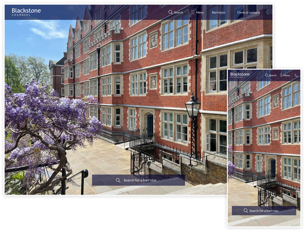
We built a new hero section capable of handling any media, be it a still image or dynamic video. This section occupies the entire available screen space, giving a high-impact visual first impression. If a video is used as the background, this silently plays and loops automatically.
Finding a barrister made easy
The barrister search bar was a key feature of the original design and is the primary navigation tool for our core users, so that remains a prominent feature in this top section. As you scroll down, a smooth animation reveals key messaging and the search bar receives more prominence. This gives a useful hint as to what the user can do next, and adds to the delight of using the website – great for building trust and maintaining attention.
No maze to wade through
The top navigation bar got a redesign too, with slight transparency allowing the hero to shine through. It’s a nice way of making the video feel part of the page. We also cleaned up the navigation, hiding features such as the shortlist until they're actually used.
Fast to load, even with video up front
Moving to such a media-heavy first impression means page load is more important than ever. Thankfully, the site’s media is served from state-of-the-art hosting infrastructure and is cached in the browser. This makes it super economical with bandwidth and shortens loading delays often associated with presenting large images and videos on websites. If video is being used, a scaled-down, mobile-optimised version is served to users on smartphones so it loads quickly on mobile networks.
Expanding the homepage
While redesigning the homepage, we added a couple of extra sections to help signpost to other areas of the site, and improve the site's SEO prospects with more content.
Easily scannable specialisms
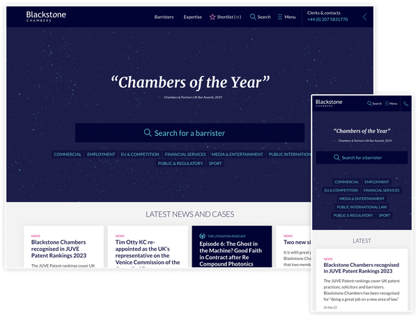
A new bank of cards provides quick access to pages on individual expertise, as well as clearly displaying the range of specialisms Blackstone's barristers offer to clients. A few of these keywords were displayed in the previous hero section design, but moving to a separate section with unique styling helps them stand out and give a clearer context.
Room to say what the chambers stands for
To provide information and links for visitors wanting to learn more, we added an ‘about us’ style section. This gives room for a snappy summary of the chambers and what the barristers stand for, with space for links to useful content aimed at prospective law students and trainee barristers.
Authority on show
Building authority and trust is critical for organisations in the legal sector, so we also added a small text carousel showcasing high-profile testimonials and credentials to reinforce authority and trustworthiness.
Accessible by design, ready for scrutiny
A chambers’ website is often the first place a client, instructing solicitor, or prospective pupil meets you. If they can't use it, that’s a lost instruction – and, increasingly, a legal risk.
Under the Equality Act 2010, service providers must make reasonable adjustments so disabled people aren't put at a substantial disadvantage, and that extends to websites. WCAG 2.1 AA is the standard most organisations work to.
Since June 2025, the European Accessibility Act has added pressure on UK organisations serving EU customers: 34% of European digital professionals now feel at risk of legal or regulatory action in the year ahead (Level Access, 2026–2027). Yet almost 96% of the top one million homepages still have detectable WCAG failures (WebAIM Million, 2026).
So every new element on Blackstone Chamber’s website was tested with automated tools and by hand, checking:
- Colours have sufficient contrast ratios
- Visual elements have adequate text labelling
- Keyboard navigation is taken into consideration to ensure anything we build is accessible to as many users as possible.
The result: a perfect 100 for accessibility in Google Lighthouse, 96 out of 100 in Silktide, and no issues found by axe DevTools when testing against WCAG 2.1 AA. Automated tools only catch part of the picture, which is why manual checks matter just as much.
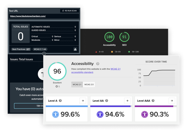
Accessibility isn't a nice-to-have for a barrister chambers website, so we we were chuffed with a raft of high scores across our testing.
Improving website design for barristers and users site-wide
As we got further into our discovery, ideas for other improvements began to emerge.
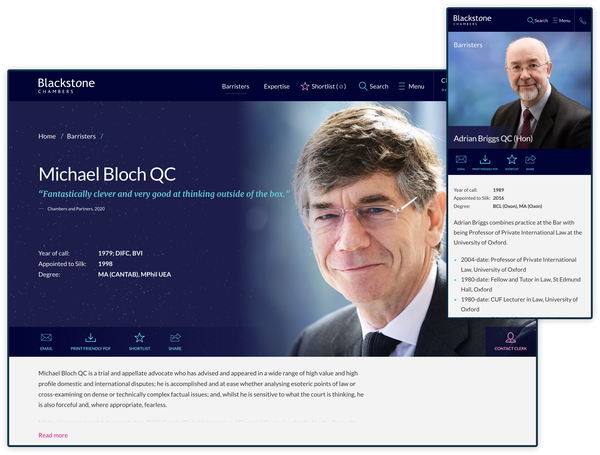
The previous chambers website design had a speckled dust texture throughout the site which was beginning to look a little dated next to the slick, vibrant homepage media. We experimented with different textures, taking visual cues from parts of the media provided by Blackstone’s marketing team where objects in the distance and vibrant colours blend together. By carrying these textures throughout the rest of the homepage and elsewhere on the site, we made the imagery feel more of an integrated feature throughout.
A facelift for the header
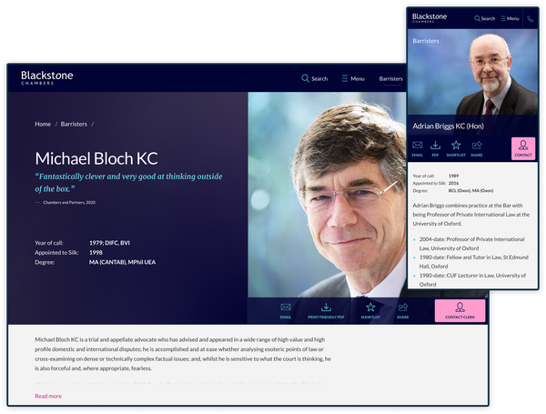
Replacing the dust with our sophisticated new texture gave us an opportunity to improve other areas of design and user experience. The header on all barrister profile pages is a prime feature of the website – where information, design and UX are key. Our updated design reads from left to right, with key information placed on the left and all interactive elements on the right, including raising the prominence of the primary call to action contact button. This was also further improved on mobile to make use of the restricted screen space, making interactive elements easier to read.
The result: a chambers website that works as hard as its barristers
Blackstone’s homepage now puts its redeveloped building and its barrister search front and centre, without losing the identity clients already trust. Just as importantly, the marketing team keeps everything current themselves in Wagtail, with no developer needed for day-to-day updates.
The refreshed barristers’ chambers website reads clearly on desktop, tablet, and mobile, scores 100 for accessibility in Google Lighthouse, and gives clients, solicitors, and prospective pupils a faster route to the barrister or information they came for. New homepage sections give search engines more to work with and point visitors to the right practice areas.
For other chambers, the lesson is a simple one. Your website can show off your home and your people without making it harder to find the right barrister – as long as it’s designed around the people who use it.