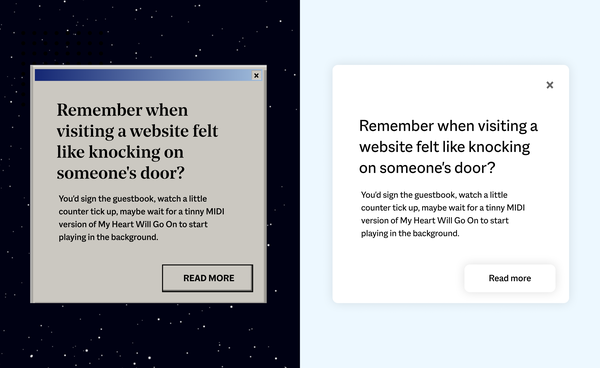
Remember when visiting a website felt like knocking on someone’s door?
You’d sign the guestbook, watch a little counter tick up, maybe wait for a tinny MIDI version of My Heart Will Go On to start playing (whether you wanted it or not).
The early internet felt like a real place. You entered sites. You left them. There were doorways, thresholds, boundaries.
Do we miss the extra 20 seconds it took to load the BBC News homepage? Not really. But that playfulness – the sense of something crafted and human – still gives us the odd pang.
While Cursive’s been around since 2008, myself (Rob) and others on the team have been building the web since the 90s. We lived through the cyber cafe craze, Flash fever, browser wars, and deployment methods best described as optimistic. Some of what we’ve survived was brilliant. Some of it was baffling. And some of it came back round when we weren’t looking.
If you were there, join us down a rabbit hole of early internet nostalgia and half-forgotten dev horrors. If you weren’t, consider this your field guide to 20 years of things we tried, binned, and occasionally brought back.
Web trends that didn’t last (and we’re glad)
1. “Click here to enter our website!!”
You were already on the website, but they gave you a doorway to the doorway anyway. Followed by a grand “Welcome to our website!!!!” once you’d formally arrived. Basically the digital equivalent of making guests wait in your hallway before letting them in. Kind of cute, but modern users bounce if a page takes longer than a blink to load – let alone if you make them knock twice.video

2. Going live without a safety net
Before version control and modern deployments, we uploaded files directly to live servers using FTP (File Transfer Protocol). No version control, no rollback, no safety net. One time, I hit upload instead of download in Dreamweaver and replaced a client’s live website with a very old, incomplete version. A few hours of terror, hair loss, and grovelling conversations with a very understanding client later, we’d restored it from backup.
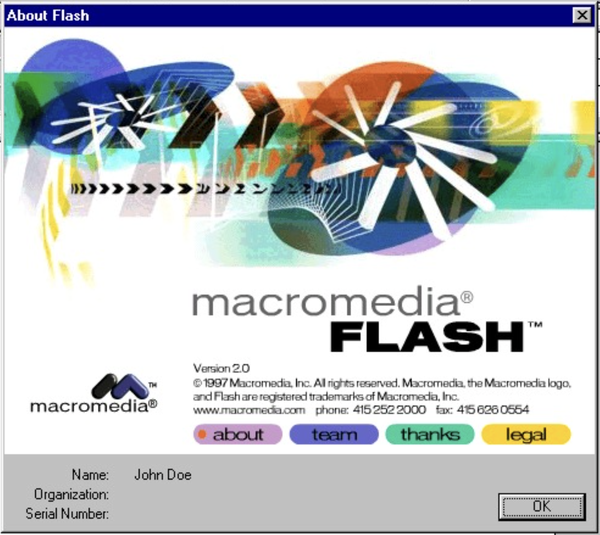
3. Flash fever
Flash was a web designer’s dream and a security team’s nightmare. It let us blend design, animation, and interactivity in ways nothing else could touch at the time – entire worlds built in a single file. But, as our senior dev Pat puts it (and he is right): “Flash was practically ubiquitous and riddled with vulnerabilities. As a proprietary browser add-on, it always felt awkward in a predominantly open-source world.”
4. Table layouts
Imagine Excel, but make it a website. Before CSS existed, we built entire page layouts using nested HTML tables. Every design change meant restructuring the whole thing. Have a look at this BBC front page from 1997 and you’ll see what we mean – it’s basically a spreadsheet in a suit.
5. Dreamweaver (and friends)
The dark days of web design software products. When it launched in 1997, Dreamweaver marketed itself as the ultimate WYSIWYG (What You See Is What You Get) tool: drag, drop, design visually, no code required. What was actually delivered? Bloated, unmaintainable HTML nightmares: dozens of nested <div> tags, inline styles everywhere, spaghetti code that made devs inheriting sites weep.
6. The Great Browser Wars
You’d fix the JavaScript in Internet Explorer and watch it break Netscape. Eventually, most devs picked a side, slapped a “best viewed in” badge on the homepage, and moved on with their lives. The wars taught us that web standards only work when browsers implement them the same way – a lesson we’re somehow still learning every time Safari decides a spec is more of a suggestion than a rule.

7. Frames within frames within frames
“What if we made navigation that stays put while content scrolls?”
At first, whoever invented FRAMESET tags appeared genius. But they went on to break the back button, confuse search engines, and make bookmarking impossible. FrameGate did, however, teach us an important lesson: just because you can nest rectangles doesn’t mean you should. The modern equivalent is probably overly complex component architectures, but at least those don’t trap you in nine circles of navigation hell.
8. Animations that weighed more than the page
Peak early-2000s internet irony: a spinning ’loading’ GIF designed to soothe impatience that literally created the impatience. We’ve since learned that if you need an animation to apologise for your load time, you’ve already lost.
9. Designing websites in Photoshop
Every button, every shadow, every state – painstakingly mocked up in Layergeddon before a single line of code was written. Then the client would ask to move something three pixels to the left. These days we design in Figma and everyone’s blood pressure is lower for it.
10. Java Applets
Waiting 45 seconds for a navigation menu to load, just so it could wobble when you hovered over it was a bit bonkers, wasn’t it? Java Applets promised interactivity but delivered mostly headaches. They were slow, crashy, and a security disaster. One of those early web trends absolutely nobody misses.
The web trend that didn’t last (and we’re sad)
11. Flash creativity
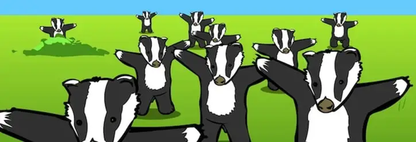
Yes, Flash had to go. Security was terrible, accessibility was non-existent, Apple was right to kill it. But it was also the backbone of early internet humour and craft. Weebl and Bob. Homestar Runner. Badger badger badger mushroom. Stuff people made just because they could. It let designers blend animation, rich media, and code into interactive experiences that couldn’t be built any other way. HTML couldn’t compete. JavaScript wasn’t there yet. Flash filled the gap – and when Apple finally killed it, modern alternatives took years to catch up.
Flash lived and died so the web could evolve. Canvas, SVG, CSS animations, WebGL – all emerged partly because we had to replace what Flash could do with open, secure, accessible standards. Turns out killing proprietary tech is a decent way to accelerate better alternatives.
Web trends that died and came back
12. Text marquees
These rolling scrolls drew attention to important announcements, but were soon seen as unprofessional and disappeared in the 2000s. I loved seeing them make a comeback on trendy brutalist websites around 2020.
13. Drop shadows everywhere
One of our favourite examples of this: this glorious BBC programme page from 1997. Peak WordArt energy, drop shadows so deep you could fall in, and Quentin Cooper about to teach you a thing or two about floppy disks. Wouldn’t pass WCAG 2.1 standards, does pass the vibe check.
Despite defining the Web 2.0 era, drop shadows became deeply unfashionable, but we’ve seen them return in a more subtle variant recently.
14. Dark mode
Dark mode started with early computer terminals and dev tools: light text on dark backgrounds was the norm long before glossy GUIs turned everything white and colourful. Now it’s back across loads of modern apps and operating systems, because we stare at screens for 12 hours a day. It can even shave a few percent off energy use on OLED displays, as long as you don’t crank the brightness to max.
Web trends that stuck and evolved
15. Proper webcraft
The craftsperson’s approach to digital platforms never went away – it just got drowned out for a while by the “move fast and break things“ trend. While others chased templates and launch-it-and-leg-it projects, some of us kept making things the OG way: understanding how things work, anticipating what breaks, and sticking around to fix it.
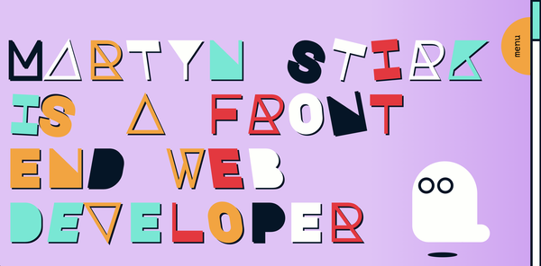
Our craft and tools are always evolving, but our underlying philosophy stays the same: make it right, make it last, take responsibility for what you build. That playful, experimental spirit of the early web is still alive, too. Our frontend dev Martyn’s personal site is proof – synthwave aesthetic, real character, animations that add delight rather than distraction. The moment we saw it, we knew we wanted him on the team. It’s the kind of webcraft we admire – not nostalgia for its own sake, but the spirit of making something with care and personality.
16. Version control and cloud infrastructure
It’s the early 2000s. Our senior dev Pat is very stressed and holding a screwdriver. Here’s what happened:
“Long before ’The Cloud’, I was renting a dedicated server in London that hosted about a dozen client websites. We checked our (very rudimentary) backup systems and discovered one critical database backup was missing. With the growing realisation that we might have to tell our clients their entire sites were gone, we ended up physically dismantling the server to remove the drive, then ran a low-level disk scan from another computer to recover the data. Hours passed. We’d all but given up when, by some miracle, it came through.”
Pat’s lesson:
- Make sure you have backups
- Make sure they work
- Make sure you have a recovery plan
- Use the cloud
This one stuck because the alternative was too painful to repeat.
17. Open source communities
The best parts of the old internet (the tinkering, the sharing, the “here’s how we fixed it” generosity) didn’t disappear – it just moved into open source communities. While the rest of the web got corporatised and paywalled, open source keeps the original spirit alive: build something useful, share the code, let others improve it. That collaborative ethos is one of many reasons we build on Wagtail and Django – tools created by communities that care more about solving problems than vendor lock-in.
18. Accessibility standards
Recipe for 90s internet nostalgia:
- Start off with the most aggressively patterned background (colours must clash)
- Add the most unreadable fonts, make them 3D, then set them on fire
Throw in as much Clip Art as you can grasp, dancing baby GIFs, an autoplaying 8-bit-style MIDI track, and voilà! You just made the most inaccessible website on the planet.
To be fair, everyone was just a bit excited to try All Of The Things back then. Now, thankfully, accessible digital platforms have earned their place at the core of good webcraft. What started as “maybe add alt text if you remember” became WCAG compliance guidelines. And something interesting happened along the way: we realised accessible sites were actually better sites – cleaner code, interfaces that feel natural to use, and content that works across more contexts and devices.
Not only is prioritising accessibility the right thing to do, but it improves them for everyone. Better keyboard navigation. Clearer information hierarchy. More readable typography. More robust testing. The principles that help someone with a visual impairment also help someone on a slow connection, or using a small screen, or just plain in a hurry.
19. Hit counters

The OG vanity metric. These counters sat in footers like a badge of honour for early webcrafters, proving someone, somewhere was looking at your Beanie Babies fansite. They told you nothing useful about user journeys, but they did evolve into the tagging approach that later powered tools like Urchin (the product that became Google Analytics), and eventually the real-time SEO dashboards we now refresh to see if anyone’s read our latest blog post.
20. Content management systems
Early CMSs gave everyone the keys to everything – which was brilliant for democratising publishing, but less brilliant when anyone could break the site at 4pm on a Friday. WordPress got millions of organisations online affordably, and we’ve built on it ourselves. But what works beautifully at launch often becomes problematic as you scale: plugin conflicts, security patches, performance issues, and Jenga-style workarounds that make the platform fragile.
Modern CMSs like Wagtail take a different approach: powerful editorial tools built on proper foundations. Lego-style content blocks that structure pages without strangling creativity. Workflows that match how teams publish. Permissions that prevent accidents without creating holdups. And an interface that feels natural because it’s built around real publishing needs, not guesswork. Devs love it too – because it’s written in Python, not PHP.
What we’ve learned
Twenty years of surviving web trends has taught us what actually matters:
Simple beats showy. The best digital experiences get out of the way. We solve hard problems with simple, elegant solutions, not flashy features that confuse users. Clarity beats complexity every time.
Proactive beats reactive. Whether it’s bugs, backups, or security patches, proactive maintenance catches blips before they become burdens. Our digital care is structured, steady, and responsive – designed to keep clients’ stress low and site performance high.
Partnerships beat projects. The agencies that ghost after launch are remembered for the wrong reasons. Our clients do important work under pressure, with high stakes and limited time. That’s why we share knowledge and show up as true collaborators – tuning in, sharing the weight, and seeing the bigger picture.
Curiosity beats convention. The best solutions come from exploring the unfamiliar with imagination and intuition – but never fixing what isn’t broken. Fresh thinking matters, but so does knowing when to leave well alone.
Make it right, make it last: We’ve been doing this long enough to know which web trends fade and which foundations stay. The internet moves fast, but the fundamentals don’t change: understand how things work, anticipate what breaks, take responsibility for what you build, and be there to fix and scale.
With you, through it all
For organisations doing world-changing work, having a digital partner that thinks for the long-term – not the trend cycles – is the difference between a platform that grows with your mission and one that becomes another problem to solve.