Change begins with clarity
Data visualisation isn’t about making findings look pretty. It’s about creating a language everyone can understand, whatever their confidence with numbers. Many changemakers aren’t data experts – and they don’t need to be. What matters is finding a digital and data visualisation agency that can turn vital research into communication that’s accessible, engaging, and easy to act on.
What is data visualisation, anyway?
The simplest way to define data visualisation is to say: it’s the art of turning complex insights into clear, compelling visuals – charts, graphs, dashboards, and maps.
Not everyone loves spreadsheets, but almost everyone can connect with a well-crafted visual. Today, it’s easy to gather endless information – but presenting it in a way people understand is a different story.
At Cursive, our data visualisation services combine design, development, and deep sector knowledge to showcase your insights to the world.

Our approach to visualising data
If your data matters (and it does), we help you make it visual, make it clear, and let your hard work shine. Our front-end dev and data visualisation designer Martyn creates sharp, simple, and shareable visuals through specialist digital craft. We can even animate charts – spotlighting stats that matter most.
As a data visualisation consultant, we always start with the story. Are we showing a comparison? A ranking? A trend? By defining the objective first, we make sure visuals serve the insight – not the other way around. Whether it’s a static report or interactive map, we design solutions to power your purpose.
We’ve tried and tested the best data visualisation software out there – from Tableau to D3 to our own Grafl.io. Every tool we use is intuitive, scalable, and integrates seamlessly with your digital platforms (we specialise in Wagtail). No clunky embeds. No fuzzy screenshots. Just beautiful, usable visuals.
We don’t disappear after launch. Many of our partners keep us on as a long-term digital and data visualisation company, helping refine, update, and evolve their visuals and platforms as their mission grows.
Who we’re here for
We partner with purpose-driven people who need their research and their cause to land with clarity and impact:
Charities
Using data to inspire action and attract funding
Think tanks
Translating complex policy into persuasive visuals
Nonprofits
Simplifying research findings with smart design
Education & academia
Empowering diverse users with accessible insights
Our data visualisation in action
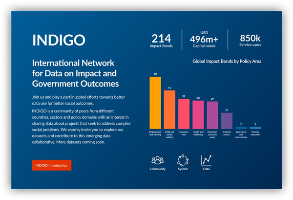
GO Lab (University of Oxford)
Bringing a vast dataset to life
Oxford’s Government Outcomes Lab (GO Lab) needed to present complex datasets without overwhelming users. Partnering with its researchers, we co-designed live, editable data visualisation tools that allow filtering by sector, project type, stage, country, and more – surfacing trends that were once invisible.
The Cursive team certainly knows how to make data and datasets more digestible for our audience.
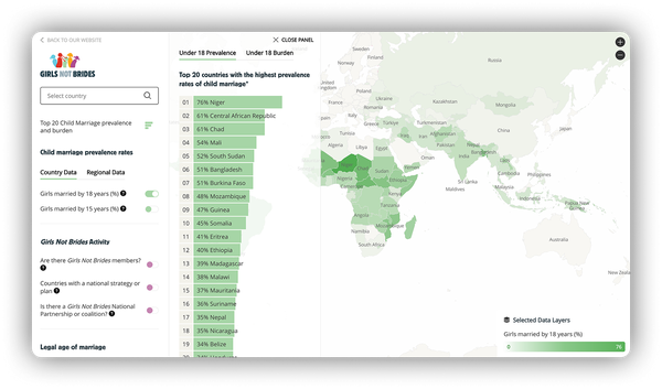
Girls Not Brides
Exploring a world of interactive insights
To shine a light on the global issue of child marriage, Girls Not Brides needed a way to make complex research easy to explore. We integrated powerful site search tools with an interactive atlas, allowing users to explore and filter data for a more meaningful, intuitive research experience.
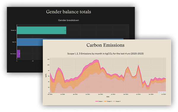
Dupe VFX
Making sustainability visible
As a certified B Corp, Dupe VFX needed to report on sustainability metrics with clarity and transparency. We made integrated tools that visualise its CO₂ emissions, gender balance, and project impact – helping the company communicate progress with confidence.
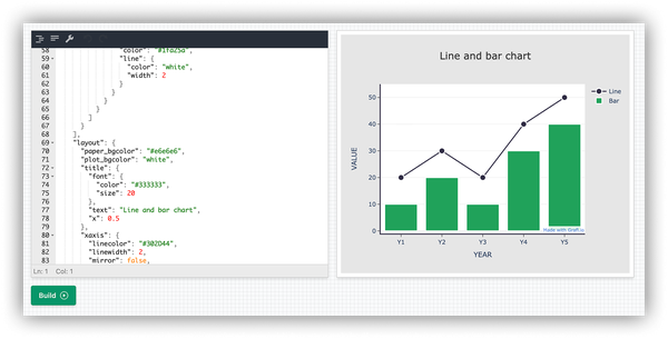
Grafl.io
Simplifying data on every device
Our in-house data visualisation tool Grafl.io brings vast data to life with minimal fuss. It’s ideal for changemakers that need great looking and functional interactive charts, graphs, and plots for all to use. No awkward pinching on mobile. No squinting at screenshots. Just responsive, interactive charts that look as good on a phone as they do on a desktop.
Why visualising data matters for changemakers
Data is power – but only if people can connect with it. For think tanks, charities, nonprofits, and educational organisations, visualising data can:

Clarify without jargon
Turn complex subjects into simple communication with thoughtful, human-first design
Cut through the noise
Highlight what matters with the best data visualisation examples, building trust and clarity
Support better decisions
Give funders, policymakers, and teams accessible insights to act on quickly
Bring people with you
Empower and rally supporters, trustees, and communities around shared understanding